Stress and isolation among adults have been on the rise in the past couple of years, studies reported that 84% of adults in America report feeling stressed weekly and about 22% of adults feeling socially isolated
Including leisure activities in a person's week allows for stress reduction, relaxation through participation in pleasant experiences, and the creation of new social relationships by involvement of leisure activities.
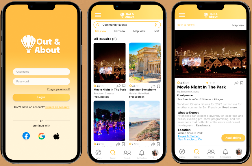
Out & About is an app that aims to promote adults' participation in leisure activities and decide which new they adventure they want to embark on by recommending various experiences from local businesses, hosts and community events.
Timeline: July 2022 - September 2022
Tools: Figma, Notion, Octopus, Procreate
Role: UX Researcher, UX/UI Designer, Branding, Usability Testing
Client: DesignLab Project
Target Audience: Adults 21-60
Research
Secondary Research
Competitive Analysis
Contextual Inquiry
User Interviews
Define
Problem Statement
Solution
Personas
Empathy Map
Ideate
Task Flow & User Flow
Site Map
Card Sorting
Design
Sketches
Branding
Interactive Prototype
Test
Usability Test
Affinity Map
Iteration
As the COVID-19 shelter-in-place restrictions are slowly getting lifted and more business and events are starting to open up their to customers, I found myself in a couple of group chats tasked to find activities that the group could do together locally. The process of searching, sharing, and booking activities and/or experiences locally required more effort than anticipated, having to look back and forth several articles, blog posts and apps and then sharing the links to the group chat. I found that there were inconsistencies in information presented and that it took a lot of time comparing activities when they are not on the same platform.
I was inspired by this chaotic process to design an app that can make it easy to search and discover local activities, book such activities for themselves for or for their company.
- Define key issues with current booking experiences
- Define user expectations from booking platforms
- Pinpoint direct and indirect competitors
I conducted secondary research to understand the impact on businesses when they use online platforms to connect with customers and the current behavioral trends in the online booking platforms.
Key Impacts of businesses having an online presence:
- 80% of local searches for local businesses result in conversions
- People primarily use search engines such as Google to looks for new experiences/activities locally. One has to swift through each search result and each search result has a different way of presenting information.
During my secondary research, I was able to identify the common different types of users to that use online-directory and booking platforms. I created provisional personas based of these users to highlight their main motivations and pain points. I created the provisional personas to to serve as one of the building blocks when I move on to the empathy phase where I create a persona and an empathy map.
With secondary research, I was also able to identify existing booking and online-inventory platforms that prove to be great competitors against Out & About. I conducted a competitive analysis of Out & About's direct and indirect competitors to see what features provide value to their products and if there are any existing gaps in their user experience that I can provide solutions for when designing for Out & About.
I went through the competitors' common assets and decided that I will include the following in my design:
- Easy to navigate categories
- Tailored recommendation list based on the user's preferences
- Simple and straightforward booking process
- Ability to provide reviews

PROS
- Lists experiences for inputted location
- Easy to navigate categories
-Clean and organized UI
- Offers virtual experiences
- Straightforward booking page
CONS
- Does not include free events
-Does not include community events

PROS
- Feed based is on user's preferences
- Allows users to edit preferences
- Allows users to follow event organizers
- Offers suggestions of incoming events
CONS
- Limited to bigger events
- No option to filter results by dates

PROS
- Reviews from customers
- Gallery is organized into different categories
-Allow in-site booking or provides links to the host's website
CONS- Reviews are subjective
- Mostly used for dining experiences

PROS
- Good for businesses and community events to gain exposure
- Allows users to book directly
- Direct social interaction with users
CONS
- Difficult to filter through businesses around the area and search for specific experiences
To complete the research phase, I conducted 1-on-1 interviews. Since I this app is targeted for adults, I recruited participants ages 21-50 years old. The main goal of the interview was to observe how users find and book local activities. I also asked the participants reflection questions to dive deeper in to their motivations, frustrations and expectations from their online booking/searching experiences. Listed below are some of the key findings from the interviews:
- 100% of the participants have positive feelings towards trying new activities/experiences
- 80% of the participants that they enjoy doing activities more with other people
- 60% of the participants stated that social media and their social groups influence them to look into/try activities
- 100%of the participants state that they have to look through different search engines or online directories to look for activities
- The participants stated that the process of looking through different articles, apps and endless results while going back and forth different screens is time consuming and draining
-100% of the participants begin their search for an activity by narrowing down the location
- 80% of the participants use a combination of search engines, social media and online directories when searching for activities
- 100% of the participants mentioned that they need organized categories to help them narrow their search
- 60% of the participants stated that when using an online inventory app, they want the ability to set preferences so that the feed can be tailored to what they are interested in and what is most important to them
I also analyzed the competitors' common areas of improvement and have made it a priority to find a solution for the following:
- Include events at different price points, size and community events
- Add an extensive filtering system
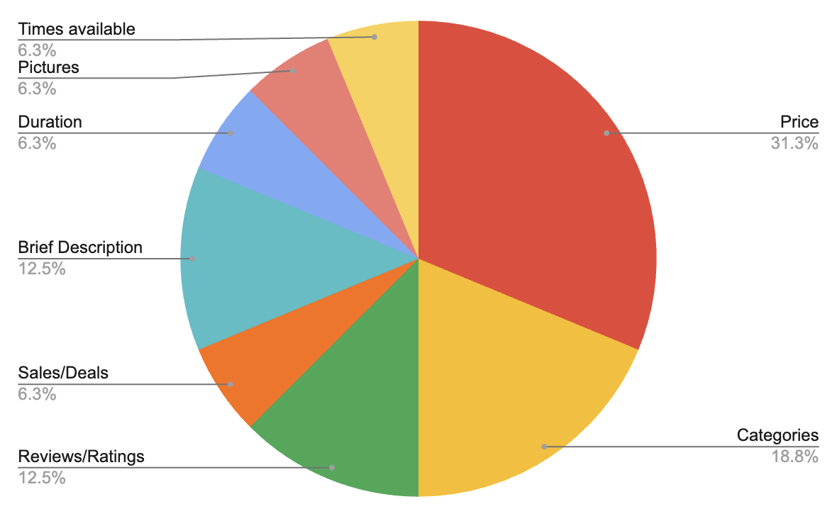
It was important for me to see which elements/details do the users find most important when they are looking for an activity after deciding on the location to see how I would prioritize these elements when creating visual hierarchy. This pie chart was a great visual to guide me in creating the visual hierarchy.
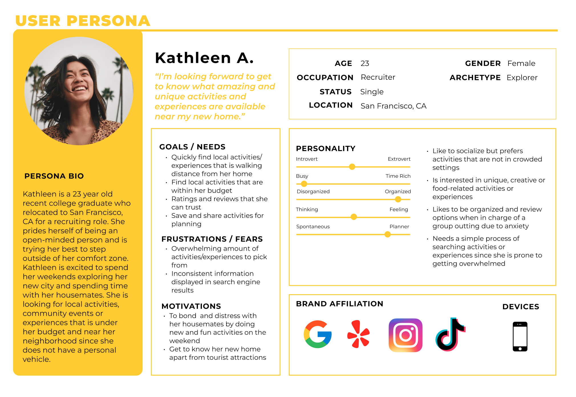
Based on my research findings, I created Kathleen, a persona from 3 common user archetypes I defined the the research phase. The 3 archetypes represent 3 different kinds of users and lists their goals and pain points when it comes for searching and booking for activities. I combined the archetype's goals and pain points when creating Kathleen's profile to ensure that the design choices I make encompass most of the users' motivations and pain points.
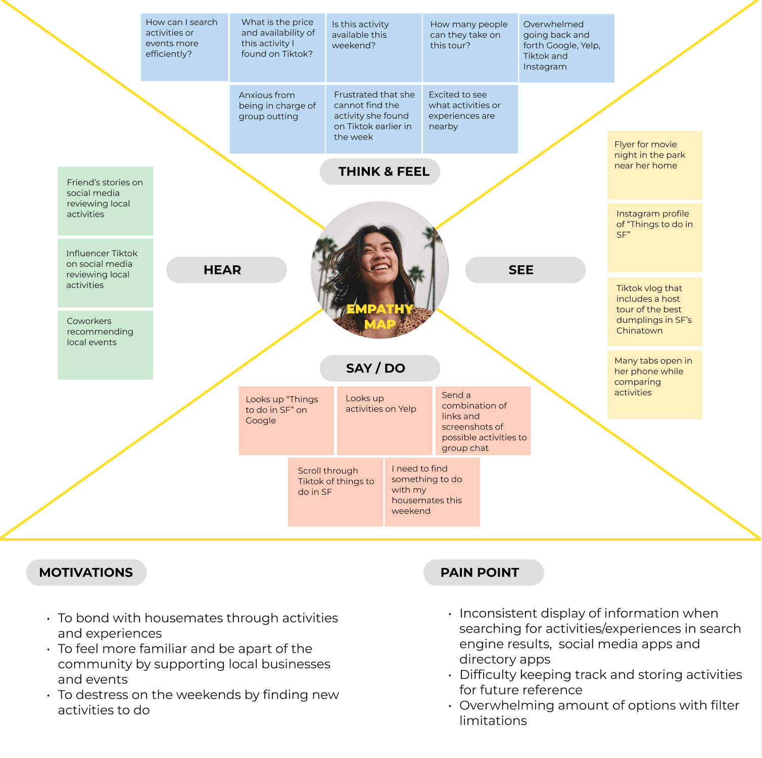
It was important for me to put myself in the users' shoes as much as possible. I created an empathy map based on Kathleen's profile. This exercise allowed me to have a holistic view of Kathleen's experience when it comes to searching and booking for activities, The empathy map was also a useful tool to organize thoughts and observations such as Kathleen's motivations and pain point. I can use the insight I collected in addition to the previous research I conducted as foundation for the decisions I need to make in the design phase.
Problem Statement
The process of searching, sharing and booking activities and experiences locally require a lot of time and effort, having to interact with multiple different platforms to complete each task.
Solution
Creating a social, online directory and booking app provides a pleasant experience for the user in which they are able to search, share and book activities in one centralized platform. A centralized platform is also beneficial for local businesses, big or small, because they are able to utilize such platform for expanding their visibility as well as interact with users.
I defined the solution by seeing where the business and the user needs overlap to ensure that design choices will be made with all stakeholders in mind.
What features should be included in Out & About?
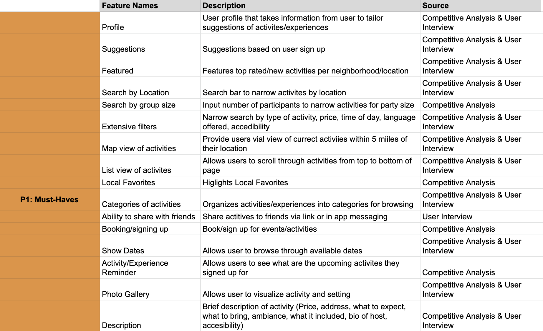
I created a master list features that are in existing booking and inventory platforms, as well as the features that the features the participants from the 1-on-1 interviews expect from Out & About. I then ranked these features based on importance and impact in a Feature Roadmap. Those in the "P1: Must Have" section are the features I found are fundamental and necessary for users to complete tasks, which I then prioritized to design first.
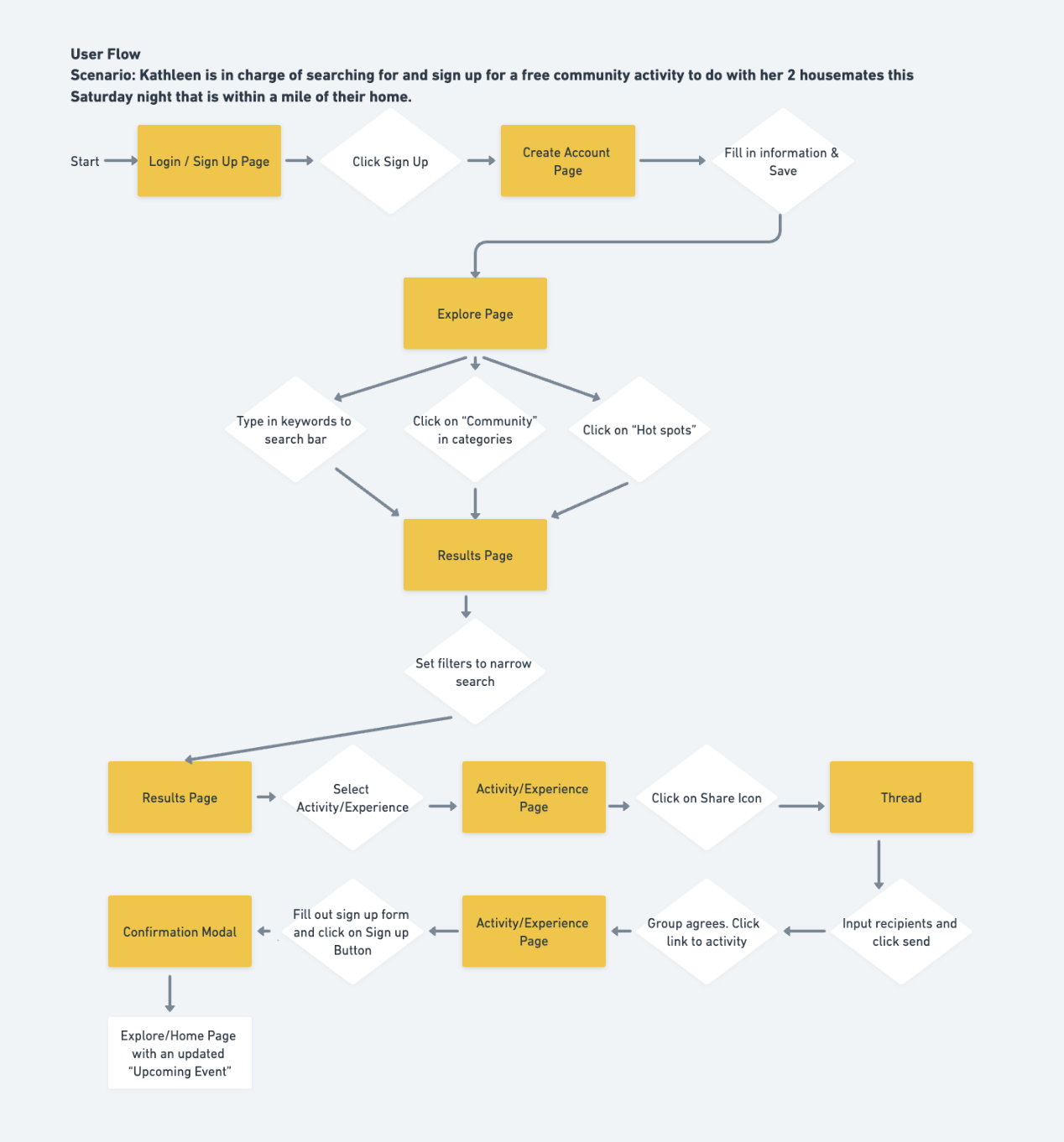
What path does the user take when using the product?
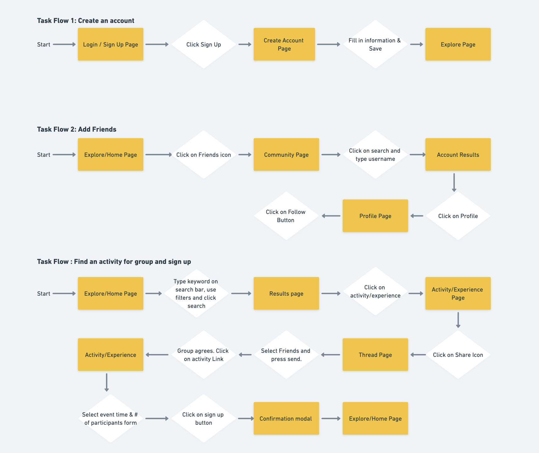
Since users are able to use Out & About to search, discover, share and book activities, it was essential to determine how each task will be completed. I created a Task Flow for the 3 main tasks a user will need to complete to book an activity for a group. I then created a User Flow based on a scenario featuring Kathleen. Kathleen was tasked to search for a free community event near her home for she and her friends to attend. This scenario covers the process of signing up, searching and booking for an activity, and sharing the activity with friends. These exercised was helpful in defining which pages and elements I need to design to ensure that the task can be completed.
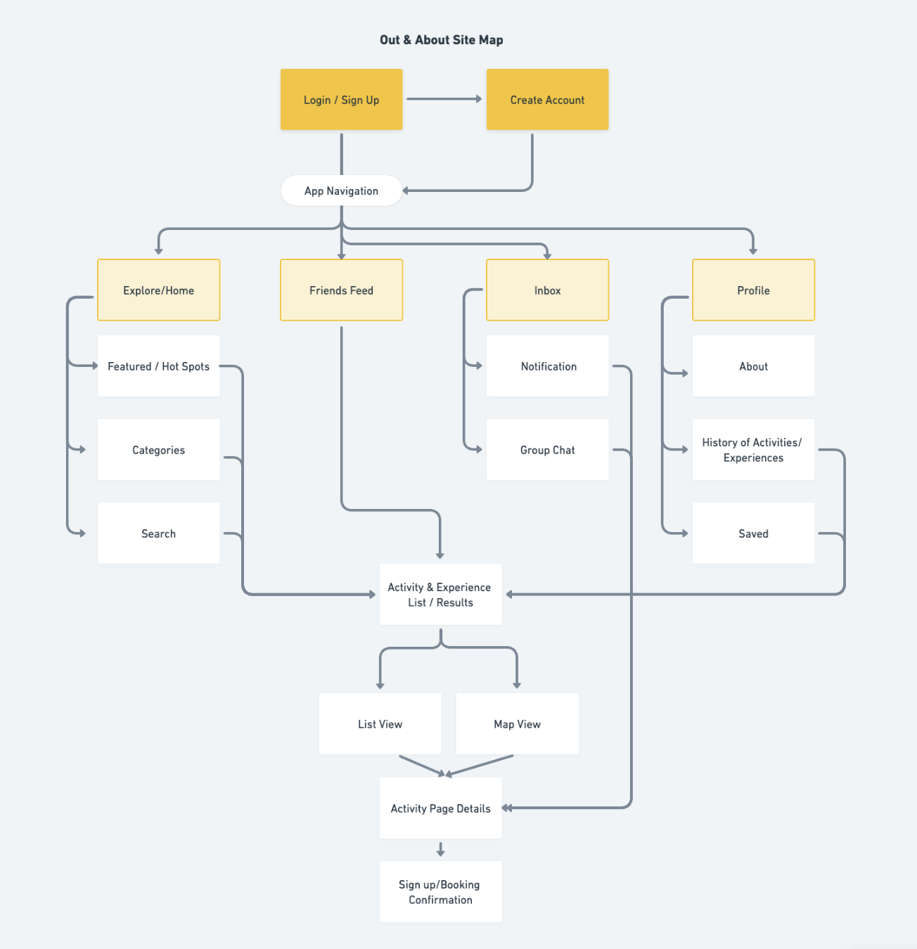
I created the Site Map to organize pages and map out the structure of the websites. During this phase, I started to feel a bit overwhelmed considering the amount of pages I needed to design and the approaching deadline.
To complete the ideate phase, I conducted a hybrid card sorting exercise using UXTweak. I recruited participants to sort a variety of activities into categories. There were predefined categories but the participants also had the ability to create new categories. The predefined list of categories were taken from the competitor's current list of activity categories. Doing a hybrid card sorting exercise helped me determine if there were any other activity categories that I can add on my existing list and also helped me decide if there were any categories that I can take out.
I produced a handful of rough sketches based on the sitemap to start brainstorming on what the app would look like. After selecting which sketches I wanted to design, I drew more details inside the sketches and tested its functionality by making it into a low fidelity prototype. With the time crunch, I decided to bypass creating the low-fidelity wireframes, and instead sketch detailed drawing of each screen.
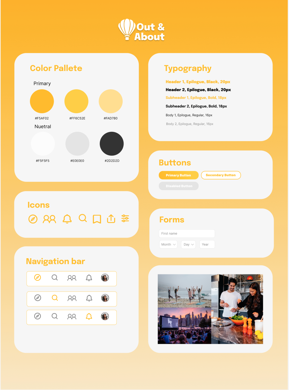
After creating my sketches, I created a style guide to ensure that I have consistency and hierarchy in the app's UI. I selected a simple color pallet because the app will consist of a lot of pictures and I did not want the users to be distracted by colorful UI.
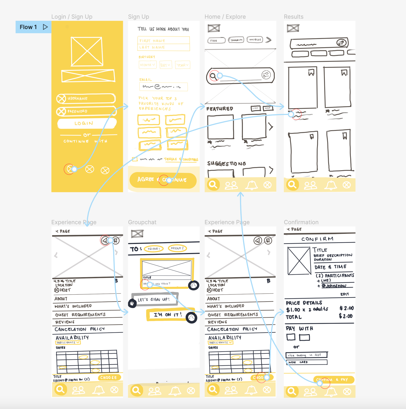
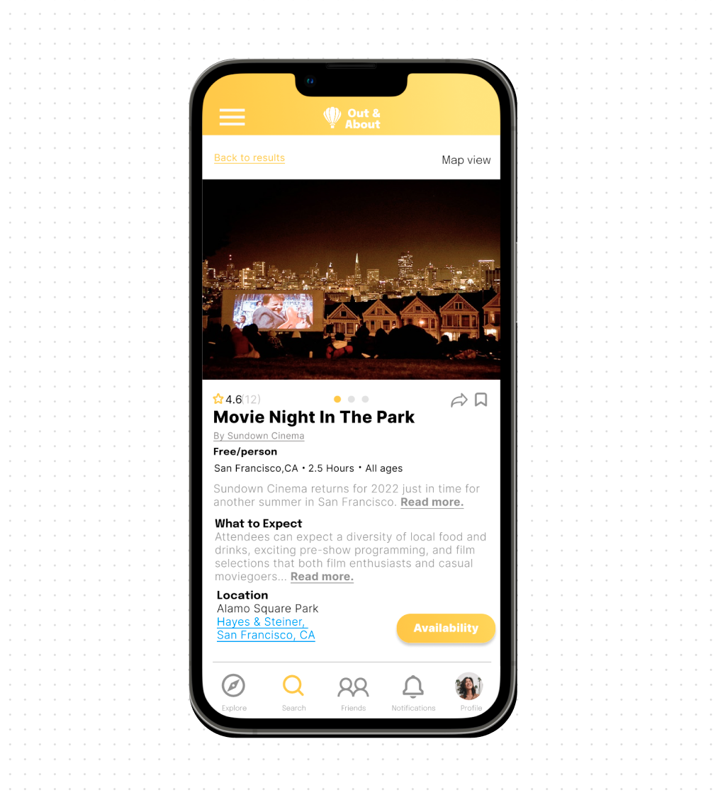
After creating the foundational structure and branding of the design, I went on with designing the high-fidelity prototype. I created screens for creating an account, searching & booking an activity, and discussing an activity with friends. I found myself referring back to the pie chart I created to decide how to design and group certain elements so that I can maintain information hierarchy. Since the app contained a lot of information, I tried my best to make sure that the most important information were visible to the user as well as make the design error-friendly.
View Prototype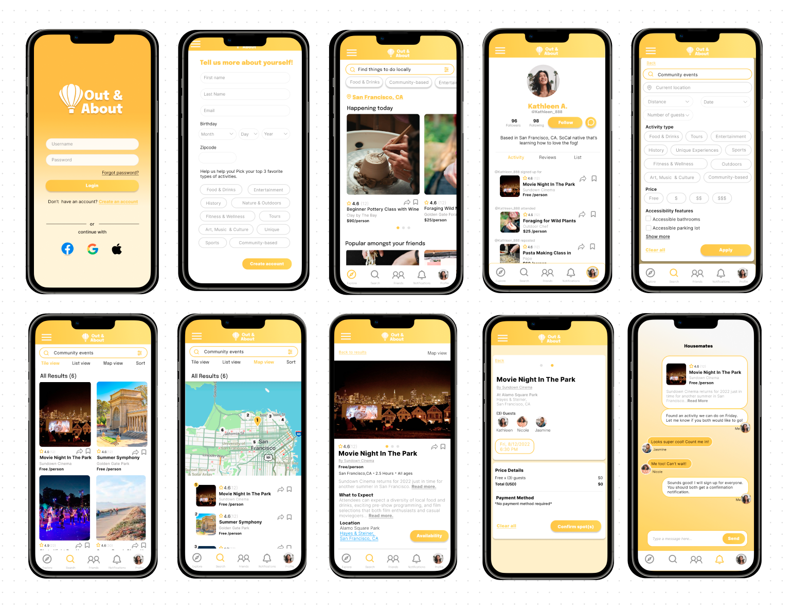
I conducted usability testing for Out & About's first prototype to test the designs functionality and also gather user insight of which areas need improvement.
By organizing user patterns and thoughts from the usability test into an affinity map, I was able to pinpoint areas of improvement and come up with possible solutions. I revised the prototype to address the pain points while considering the participants' suggestions
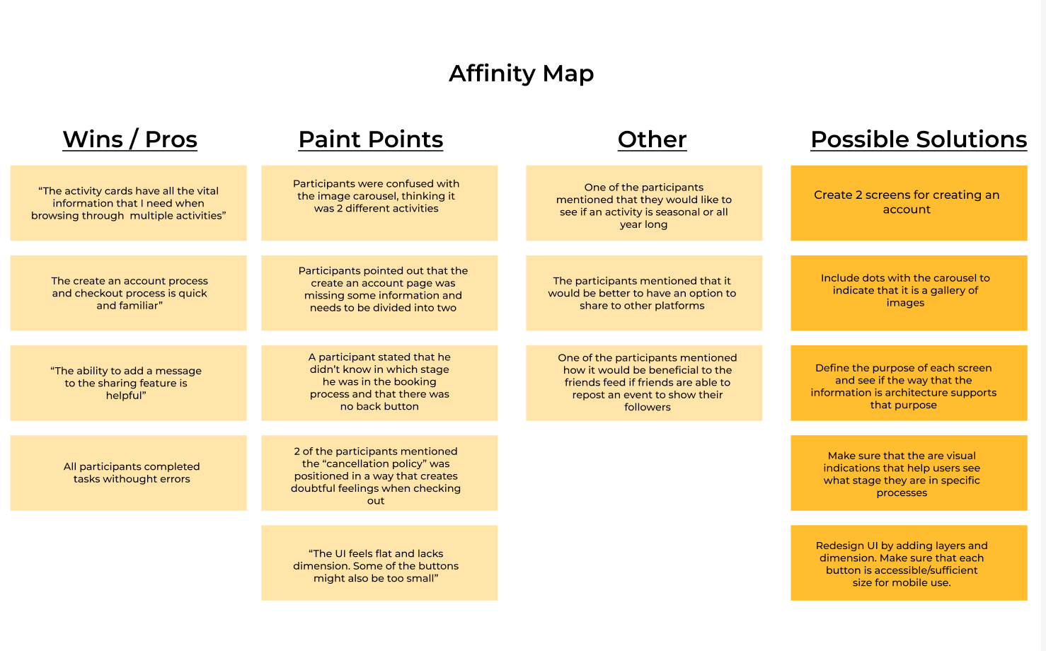
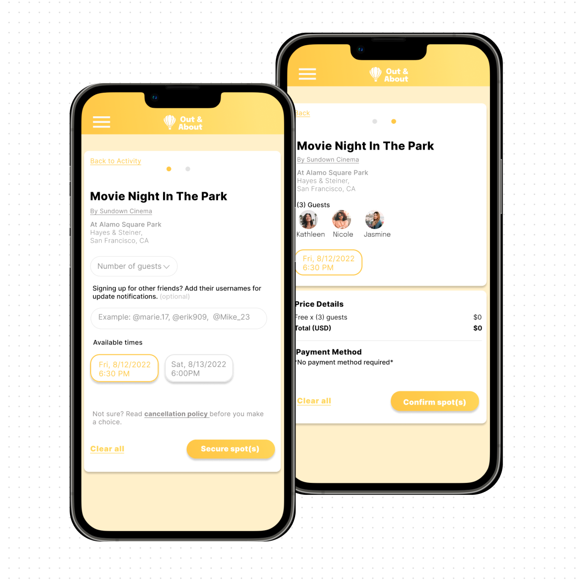
I improved the following areas after deciding that they will make the most impact in the over all flow and experience.
View Revised Prototype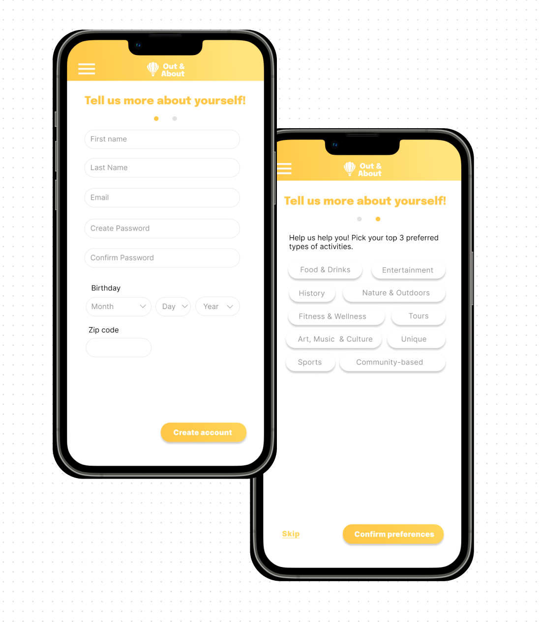
This project was a great learning experience in terms of time management and learning how to pivot when in a strict deadline. Though I was not able to create all the deliverables I had planned to deliver in the project timeline, I made the most out of the deliverables I created. I was not able to deliver cleaner low-fidelity wireframes due to time constraints, but I made sure that my sketches were detailed enough and that the screens were functional before creating the prototype. If I were to do re-do the project, I would have spent more time recruiting participants who were able to be apart of interviews sooner rather later to give me more time to work on deliverables during the design phase.