To recreate the enjoyable and welcoming Home Coffee Roasters experience in the digital space, I used my research findings to create a responsive web design and establish brand identity. Through this process, I’ve discovered how businesses can extend hospitality virtually and nurture their business-customer relationship.
Timeline: September 2022 - October 2022
Tools: Figma, Notion, Octopus, Procreate
Role: UX Researcher, UX/UI Designer, Branding, Usability Testing
Client: DesignLab Project
Target Audience: Coffee drinkers ages 24-35
Research
Secondary Research
Contextual Inquiry
User Interviews
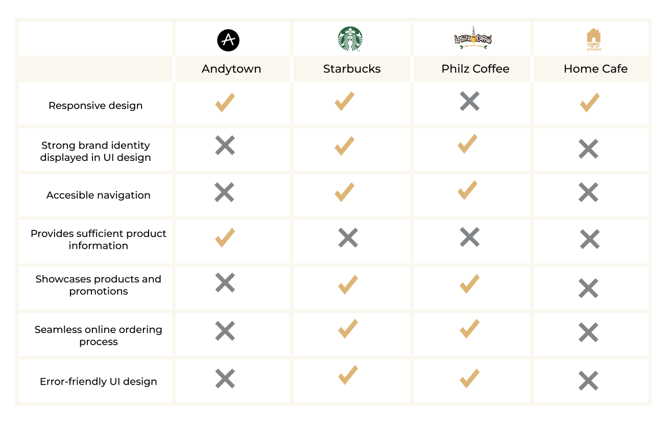
Competitive Analysis
Define
Problem Statement
Goals & Objectives
Personas
Empathy Map
Ideate
Task Flow & User Flow
Site Map
Design
Sketches
Wireframes & Wireflows
Branding
Interactive Prototype
Test
Usability Test
Affinity Map
Priority Revision Matrix
Iteration
The first time I stepped into Home Coffee Roaster’s cafe, I was immediately greeted by a barista, “Welcome home!” she said. She asked me if I was a new customer, actively listened to my response, and then provided me with tailored recommendations based on my preferences. She anticipated my every need as a customer and made me the most colorful and tasty cup of coffee. Like many others, this experience won me over as a patron - and eventually as an employee.
As Home Coffee Roasters grew, they extended their services to the digital space through e-commerce. As a long-time customer, I noticed that the Home Coffee Roasters' website's branding didn't provide the same vibrant feeling that they provide in person. And as their previous barista, I noticed that the website lacked elements that are crucial to the ordering process such as information consistency and intuitive design. I was motivated to create a web design that addresses the current gaps in the Home Coffee Roasters online experience.
- Understand how investing in an online platform affects business growth
- Identify the competitors and their website’s assets and current gaps
- Identify users’ behavioral patterns, motivations, challenges, and needs from Home Cafe’s current website
I conducted secondary research to understand the impact of investing in e-commerce and discover current behavioral trends. I found that e-commerce allow local businesses to drive more revenue through the following:
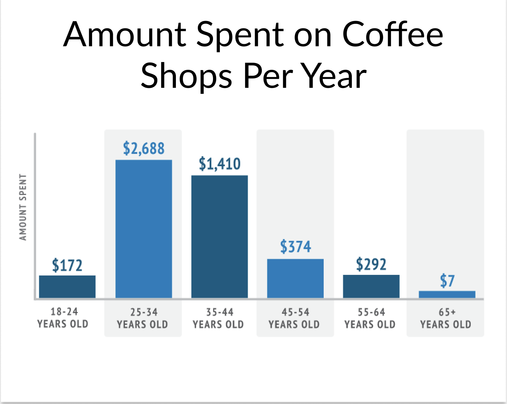
The data indicates that e-commerce positively affects businesses growth and revenue, thus validating the need for Home Coffee Roasters to elevate their business-customer relationship by investing in a thoughtful online experience and take advantage of the growing percentage of mobile orders to maximize potential revenue.
The graph shows that the demographic spends the most money purchasing coffee are 25-to-34 year olds. I chose this demographic as our target audience because it is more productive to convert a group that is already in the purchase stage of the customer journey than introduce a product to a demographic that still in the research and consideration stage.
As a business, it is important to specifically pin point which areas of the product hinders the users from the business's desired outcome so that we know exactly what problems to create solutions for.
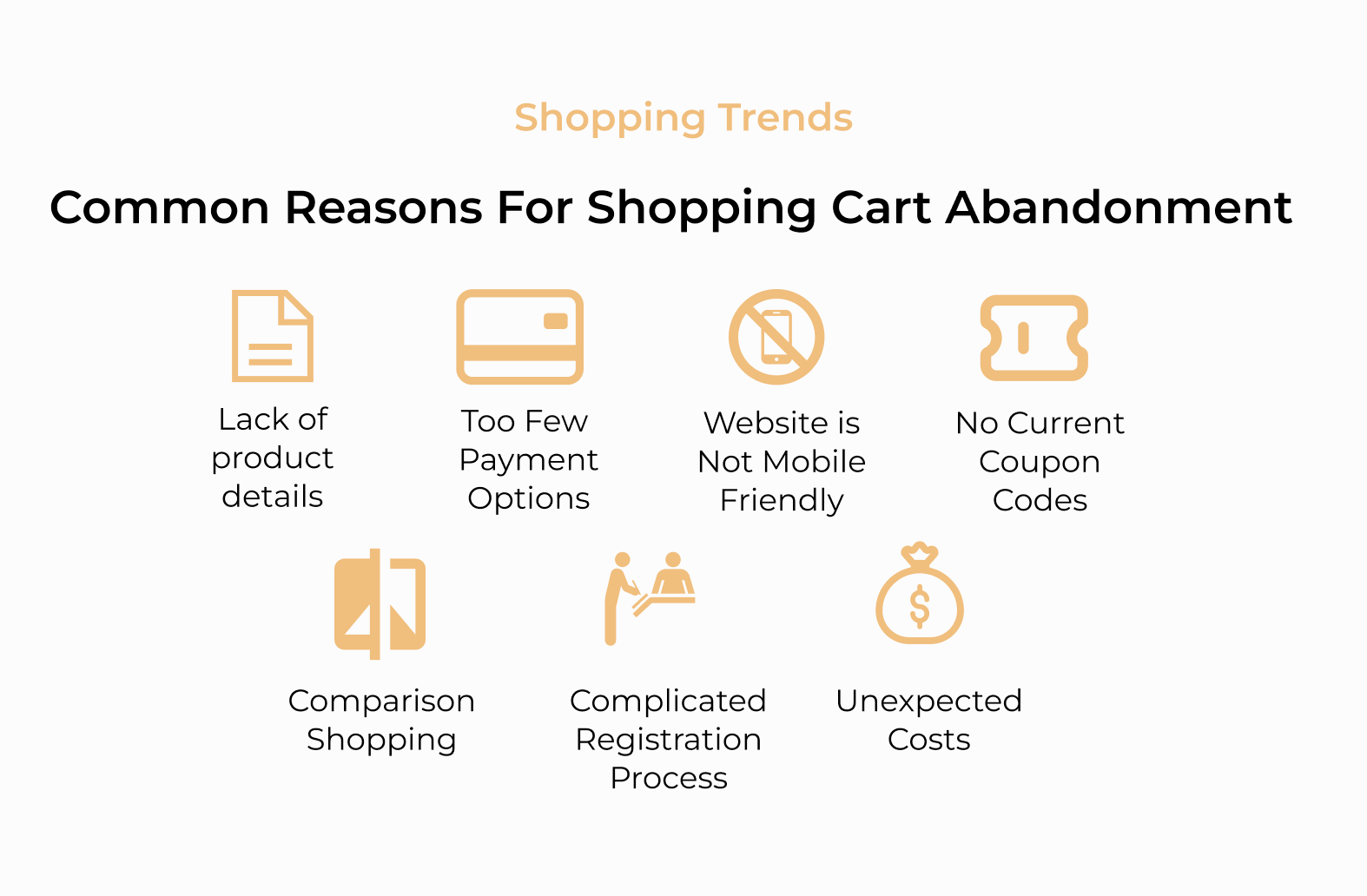
I used this list to analyze Home Coffee Roaster’s current website and found 2 areas of improvement:
- The current product cards and the product page lack product details.
- There are very few payment options in the current website
Moving from general findings and quantitative data, I conducted contextual inquiries and user interviews to gather qualitative data that provides better insight into the user’s motivations and pain points when it comes to ordering coffee online.
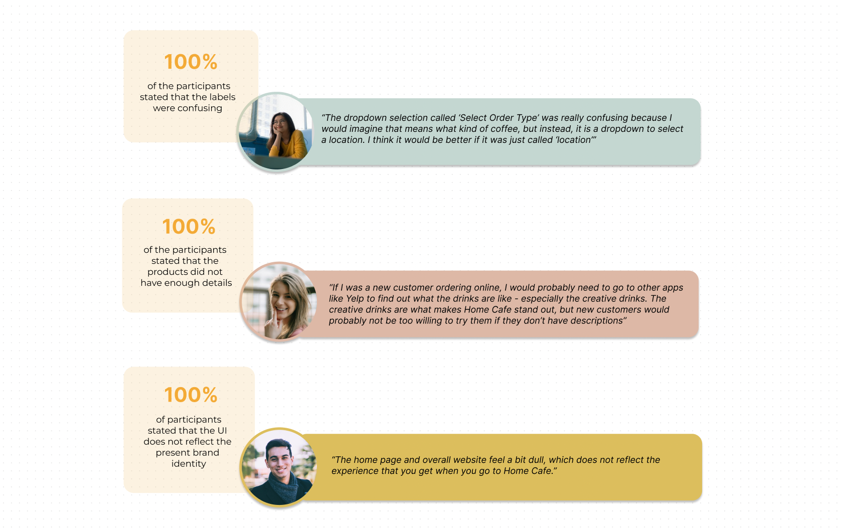
Listed below are some of the key behavioral trends I gathered from the participants:
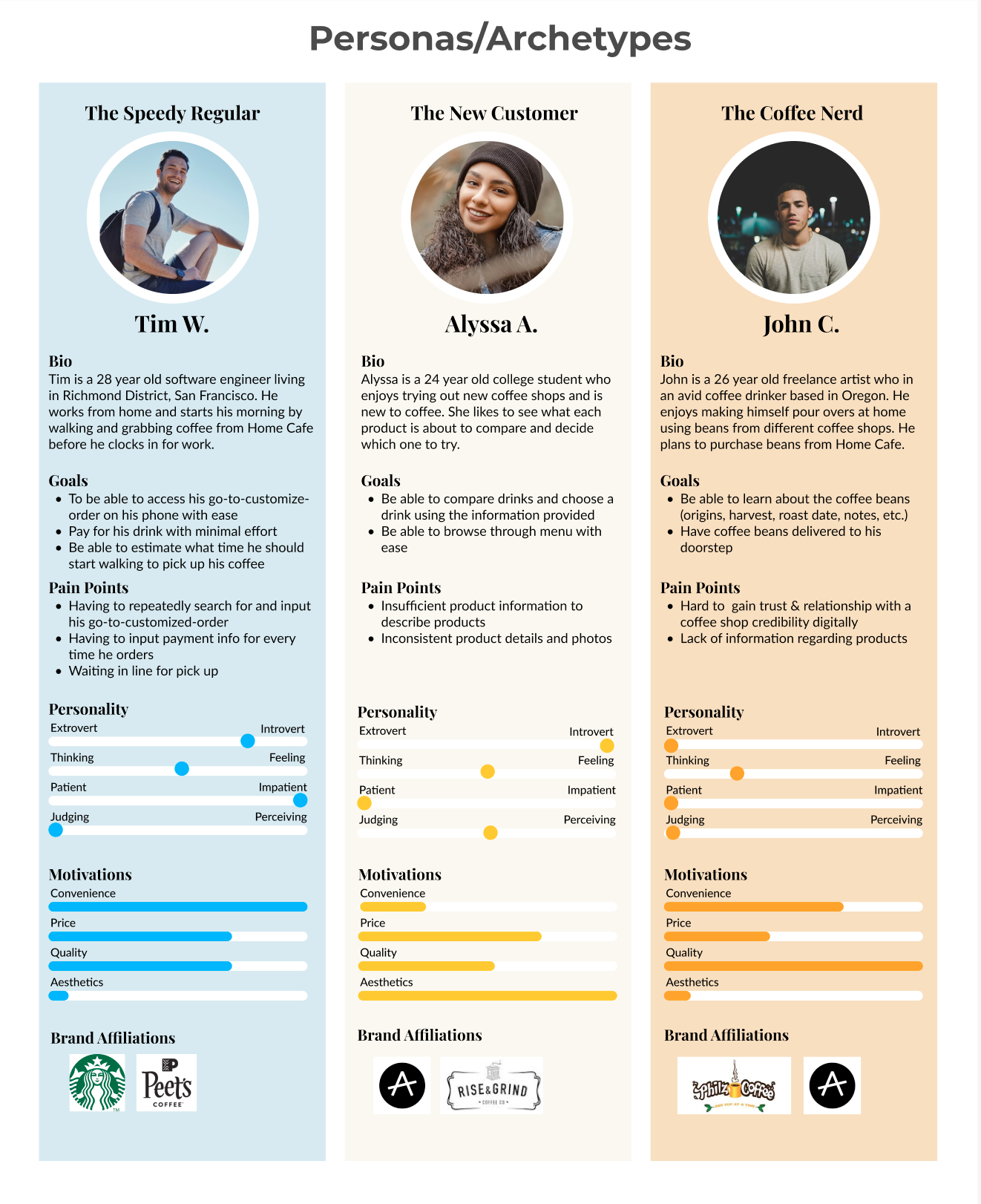
Based on my research findings, I decided to create personas of each main archetype that make up the coffee shop customer base. I decided to use three personas, instead of focusing on one, because I believe that it is important to consider as many types of users as possible to create a design that is inclusive. Prioritizing inclusive design allows more users to participate equally and independently.
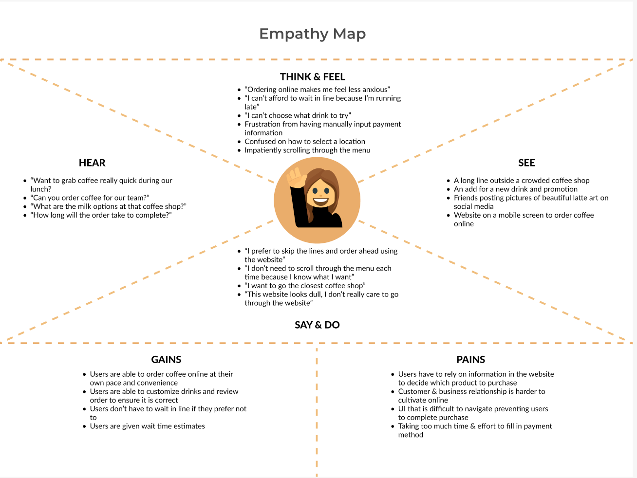
I put myself in the shoes of each persona and took notes of what each persona would think/feel, see, hear, and say/do in their process of ordering coffee online. I combined these notes with my research findings and my observations from the user interviews and funneled them into an Empathy Map.
I was important that I use multiple lenses/perspectives and evaluate internal and external factors when analyzing the purchasing process so that I can get a well rounded view of the issues. Organizing my thoughts and data in an empathy map helped me better develop a clear holistic view of the users’ pain points, needs, and motivations and create actionable goals.
Problem Statement Defined
Home Coffee Roaster’s current web design limits the business’s ability to maximize potential revenue and cultivate an online business-customer relationship due to inconsistencies in the user flow and misrepresented branding.
Solution
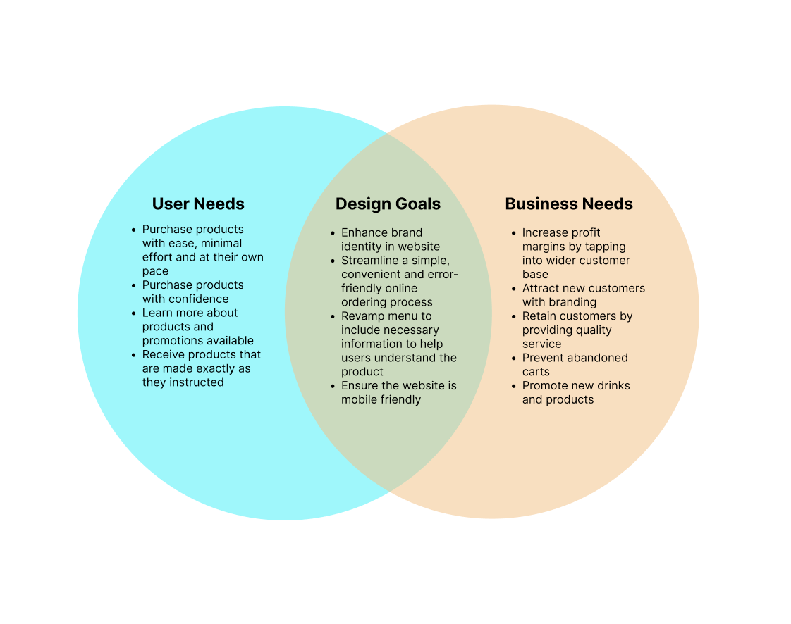
Creating a responsive design with a strong brand identity will help cultivate a secure online business-customer relationship and increase potential profits by addressing the users’ pain points & needs.
I defined the solution by seeing where the business and the user needs overlap to ensure that design choices will be made with all stakeholders in mind.
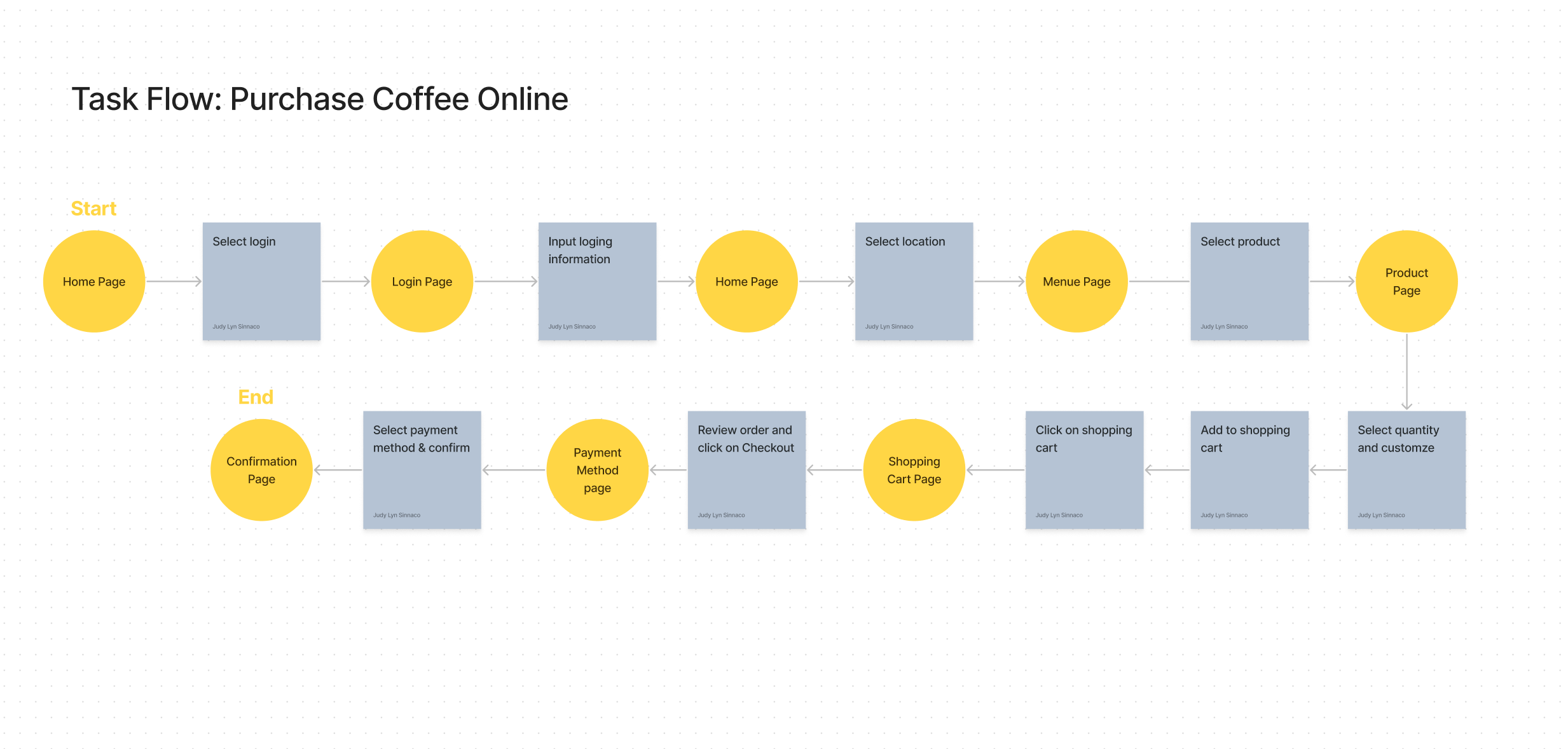
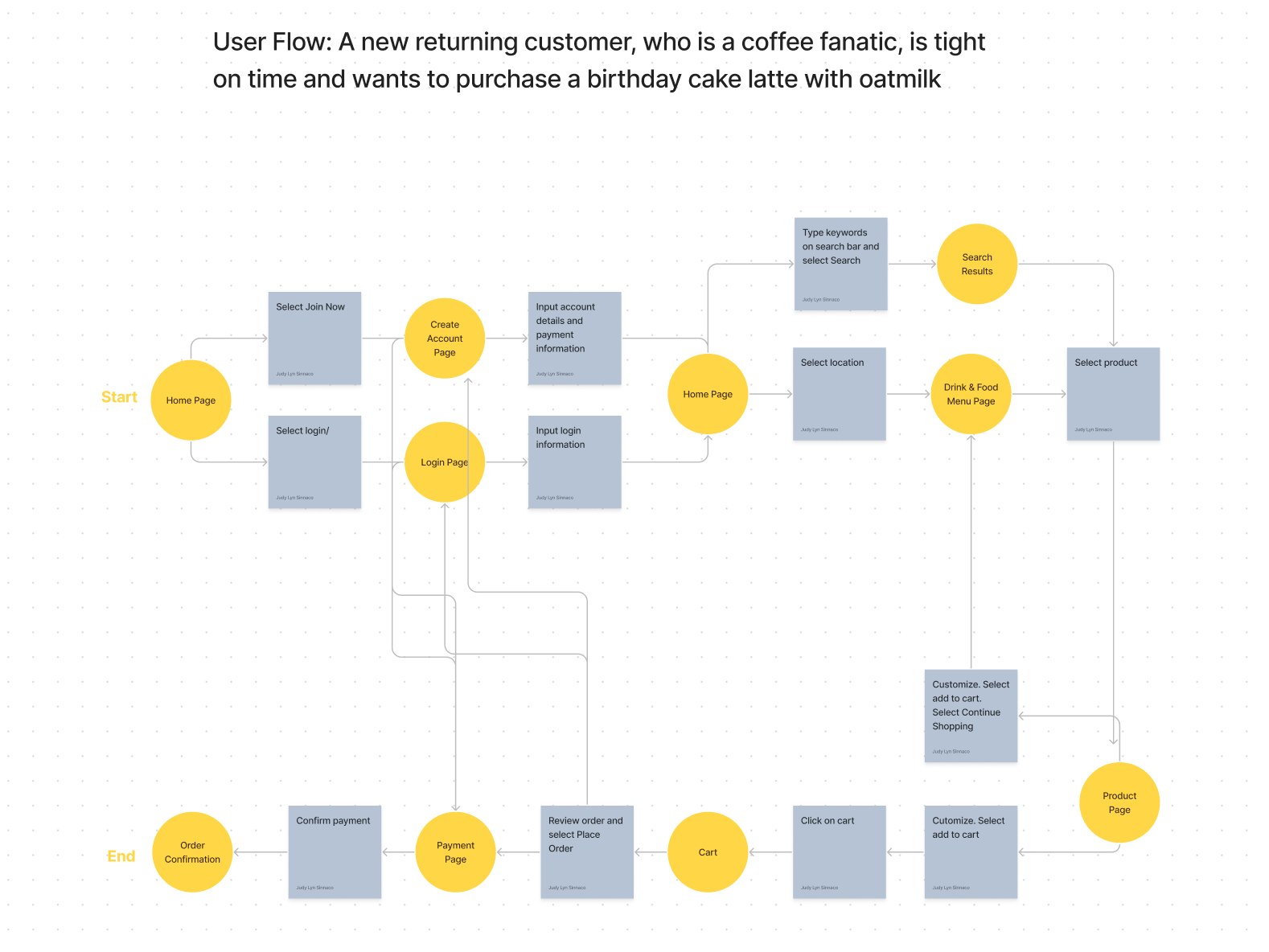
To create a solid foundation for the web design, I first created Task Flow to show a linear path of how to purchase coffee online from the entry to the exit point. With the Personas in mind, I then built on the task flow to create the User Flow and explore the different paths a user might take to complete a purchase.
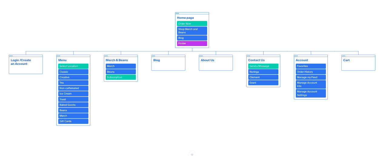
I created the Site Map by analyzing which pages and features in the User Flow are needed to complete the tasks. I also included enhancements such as “Blog Posts” to make the website more personable and establish credibility, as their competitors successfully do.
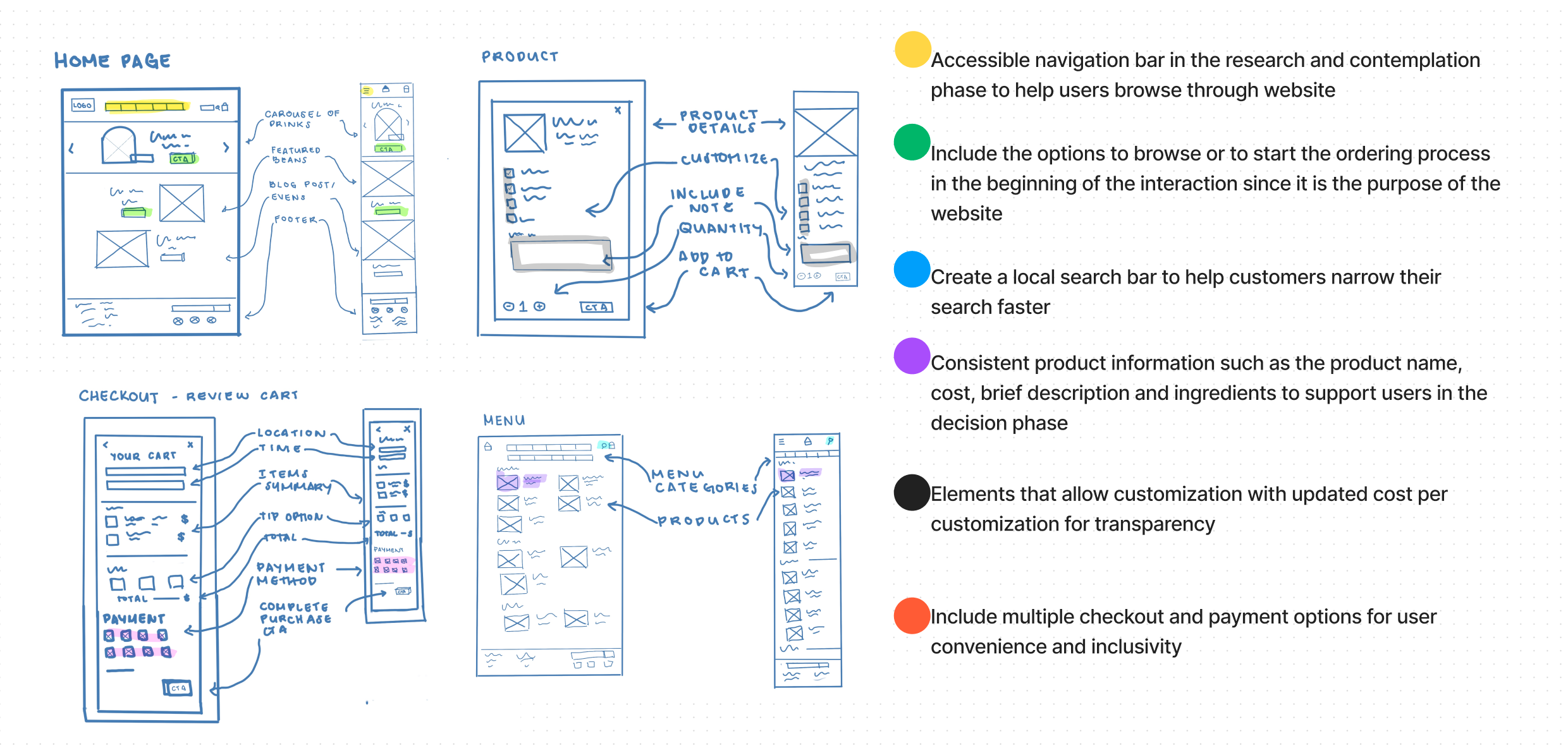
I produced a handful of sketches with design goals in mind before creating the low-fidelity wireframes. Listed below are the key elements of my design plan. Each element has a purpose and part to play in improving the user experience. In this stage, I made sure to address the problem areas that were defined in the research phase such as product information inconsistencies and limited payment options. I also ensured that I included elements such as customization options with updated costs, a search bar, and an accessible navigation bar to promote efficiency and ease in the user's experience since these qualities were valued the most per user interviews.
After the basic concept of web design was created, I tested its functionality by creating wire flows to ensure that I have all necessary elements present in the design to be able to complete the intended tasks.
View Low-Fidelity Wireframes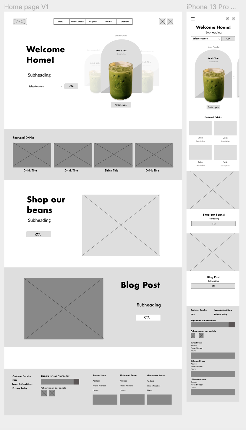
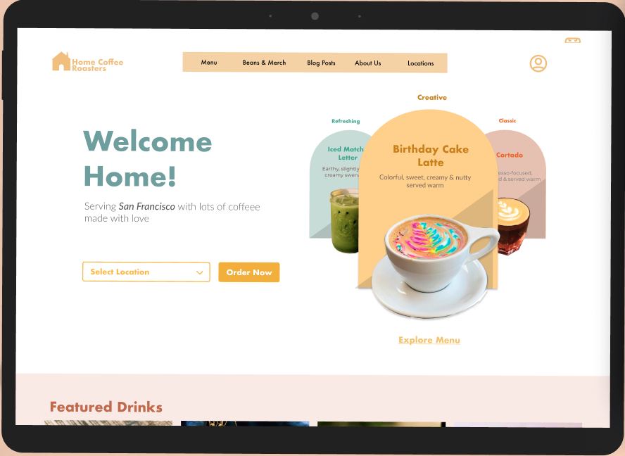
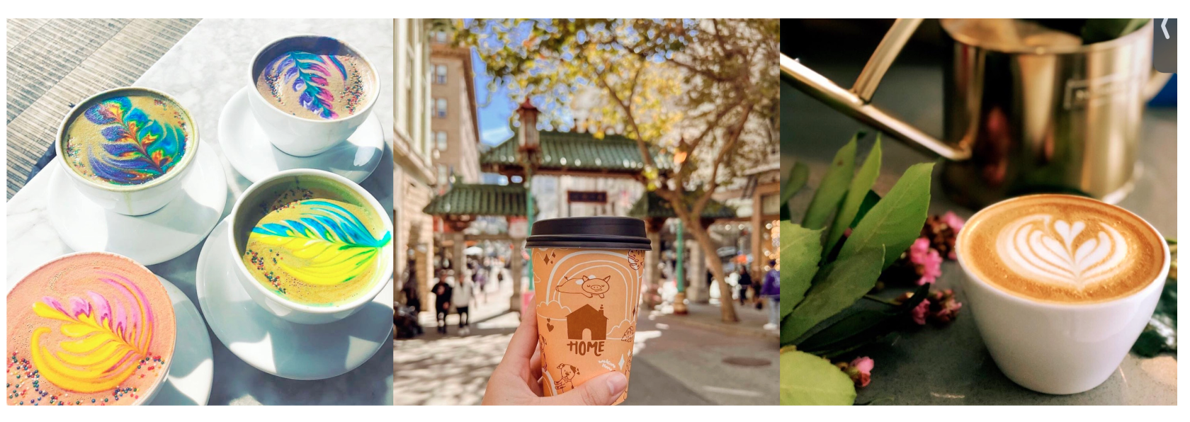
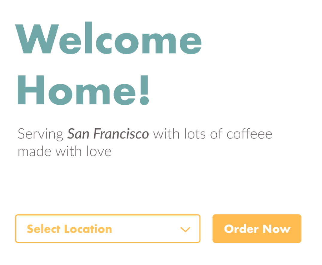
Throughout the research phase, the customers have always mentioned how fun, creative and vibrant Home Coffee Roaster’s brand was. When creating this Mood Board, I took inspiration from Home Coffee Roasters’ social media accounts as well as other e-commerce accounts with similar personalities. I chose a colorful, earthy, pastel color palette based on their current coffee bean packaging and cafe interior. I wanted the branding of the website to resemble Home Coffee Roasters’ cafes as much as possible. I decided to keep the illustrative part of the current Home Coffee Roasters logo and take out the text because the font was hard to read on a desktop and even harder on smaller screens.
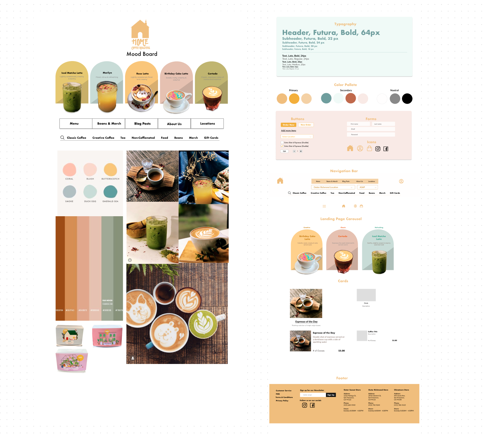
Creating the Style Guide proved to be one of the most challenging parts of the design phase due to the number of different colors in the color palette. To establish my primary, secondary and neutral colors, I tested multiple color combinations on the wireframes to see which sets of colors and combination best supports information hierarchy. During this process, I learned to keep my images simple and to ensure that there is enough white space to create harmony.
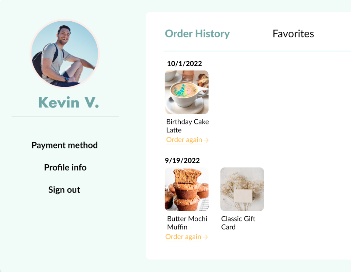
I presented a rough draft of my Prototype to a group critic and my mentor for constructive feedback before putting it to the test in the hands of users. The collective feedback pinpointed that a user flow was missing: signing up/logging in and using a profile to complete a purchase. I created a Sign Up/Login modal pop-up and a Profile page to address the gap.
View 1st Prototype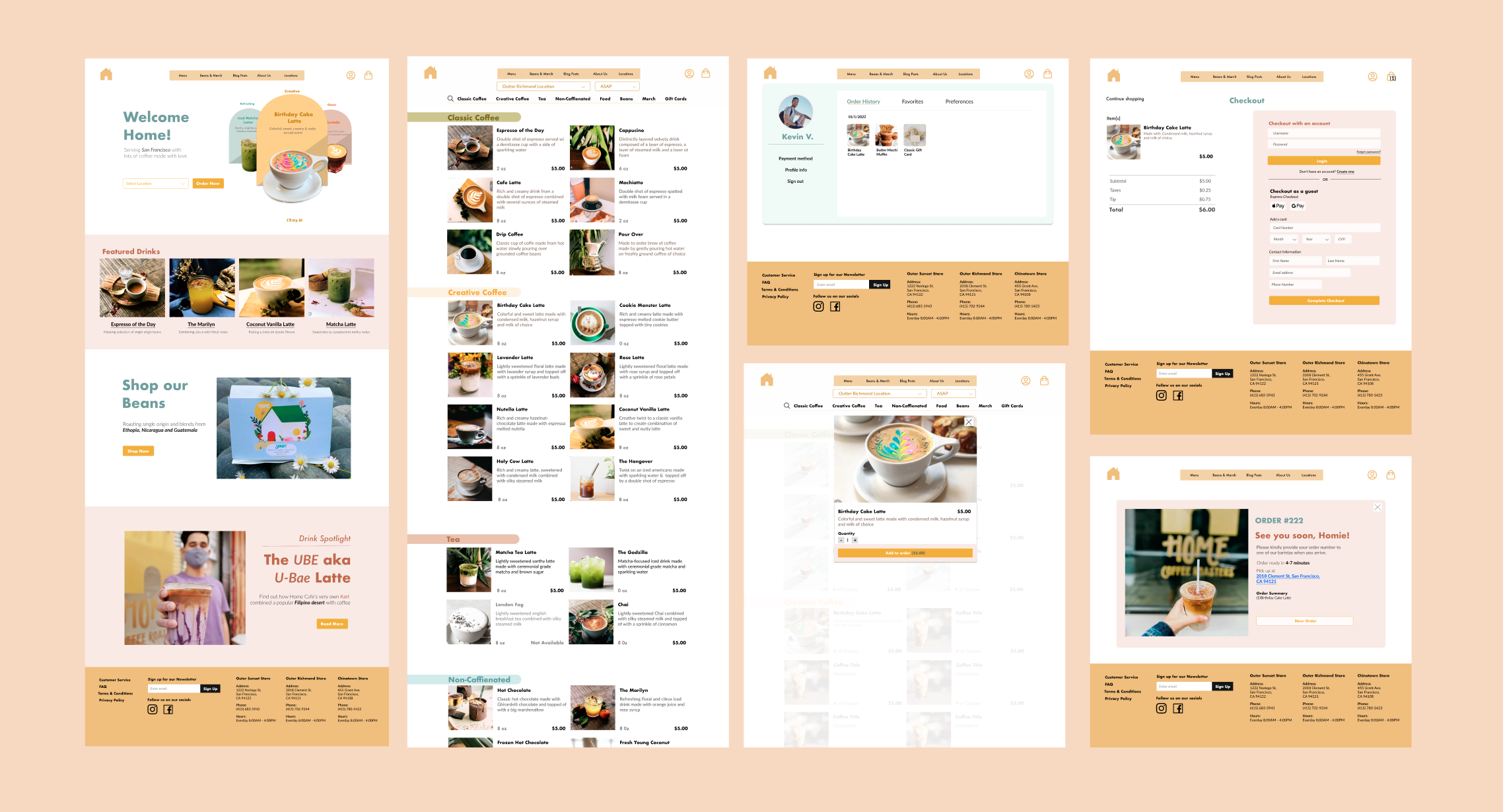
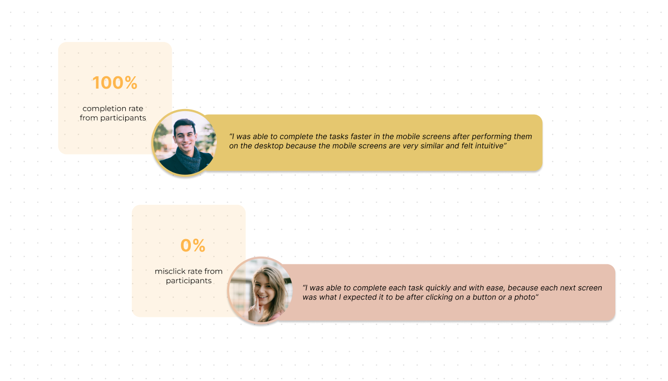
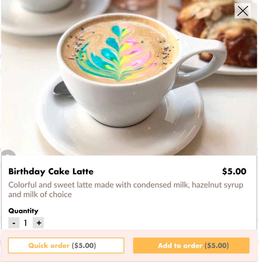
I ran usability tests to validate if my design was functional, error-friendly, and navigable. I conducted moderated testings via Zoom and in person. Each participant was asked to complete 2 different tasks, first with a desktop screen and then with a mobile screen. The participant's first task was to search for and purchase a birthday cake latte as a new customer. After that, they were tasked to repurchase a birthday cake latte as a returning customer.
I achieved my goal of 100% completion rates with 0% misclicks from the participants, proving that the prototype is functional. Though I hit my marks, there was still a lot of room for improvement.
After the tasks were completed, I asked the participants a list of reflection questions to discuss my observations of their behavior as well as their overall thoughts, feelings, and input on the prototype. Having a reflection period at the end of each usability testing allowed me to understand the user's experience in more depth than a completion or misclick rate could.
I used an Affinity Map to organize my observations and the participant’s feedback into wins, pain points, and suggestions. I then created a list of possible solutions to address the pain points while considering the participants' suggestions.
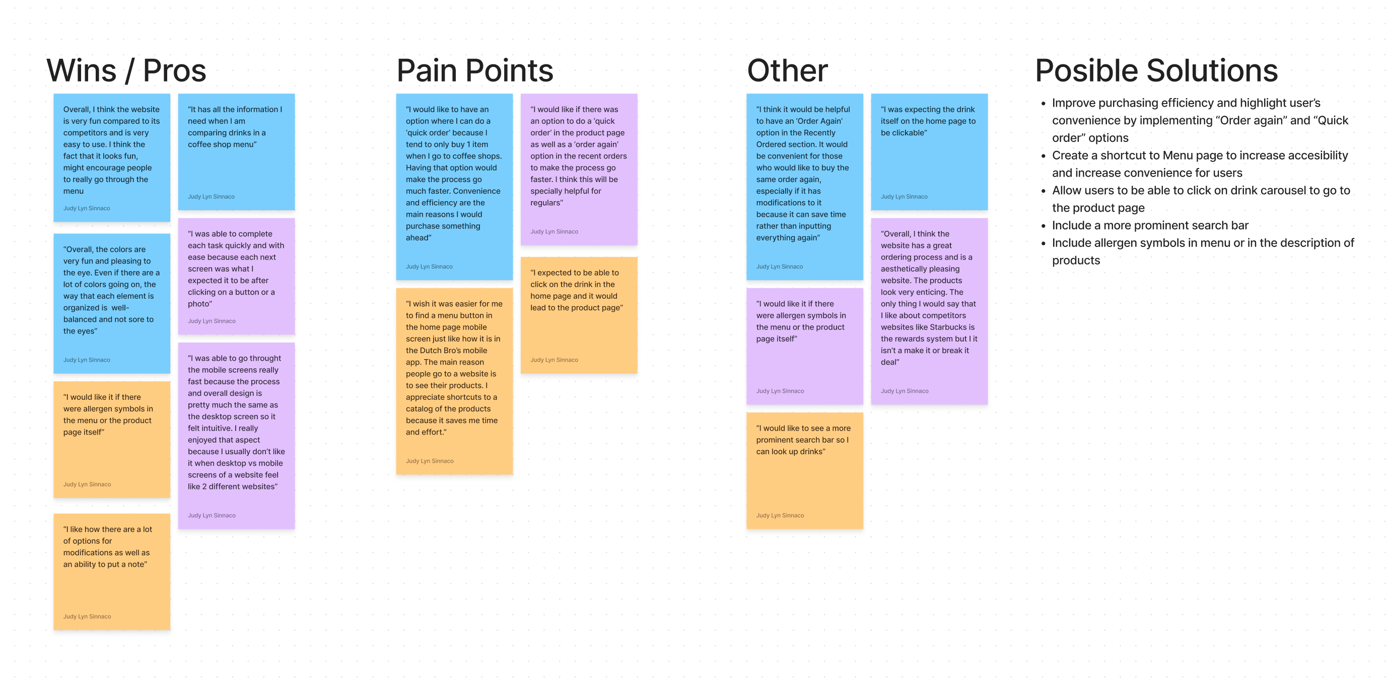
With limited time left to complete the project, I placed my attention on finding solutions for the issues placed in the most critical situations quadrant - upper left of the revision prioritization matrix. These solutions have the greatest impact on the users’ experience while being actionable and achievable within the time constraints. I created a backlog for iterations that would be difficult to include in the first revision but could be done in the future.
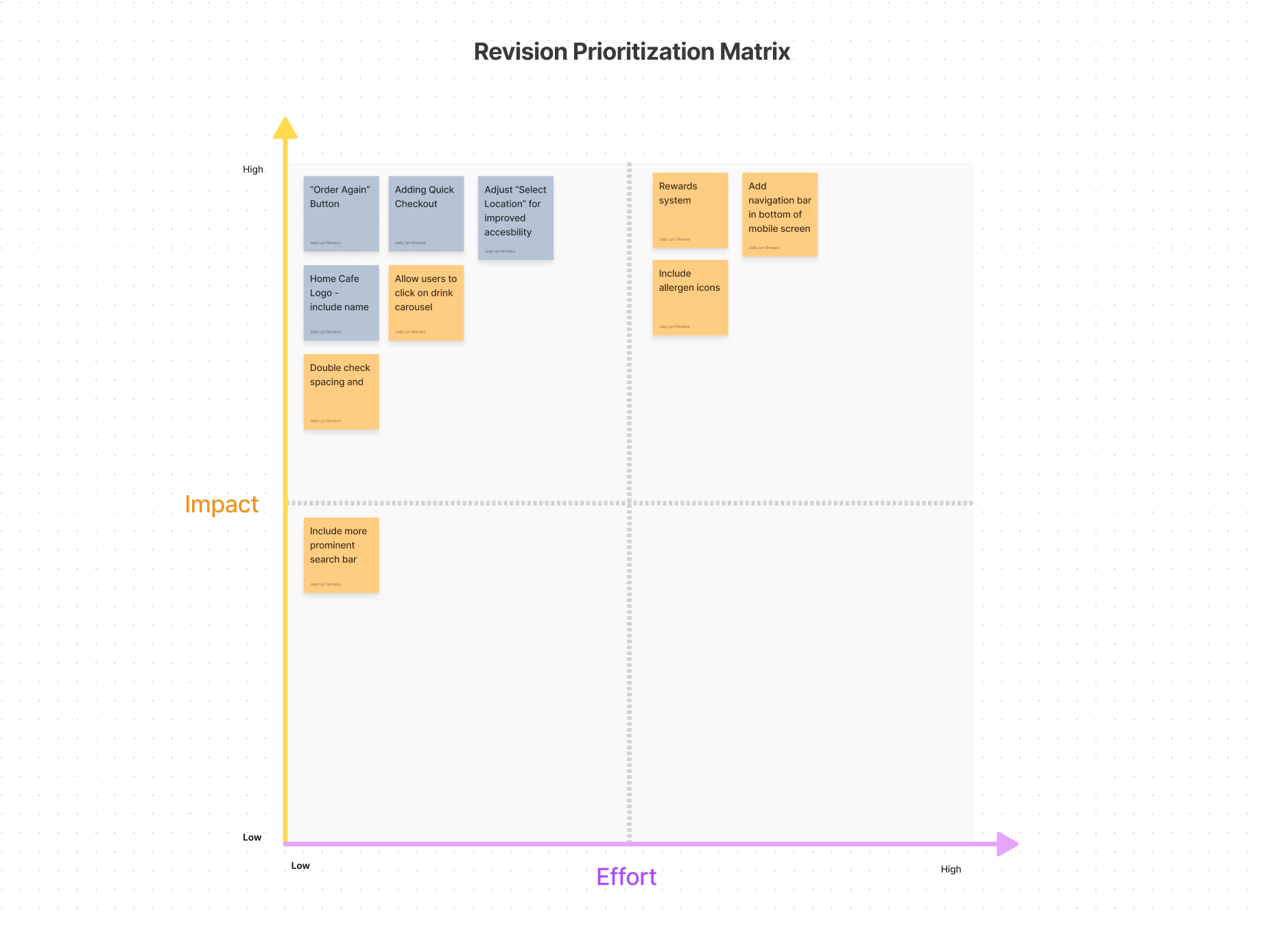
After prioritizing what revisions to be made, I addressed the following issues to improve accessibility as well as promote convenience in the user experience.
This was an exciting project to create because of my personal connection to the business and passion for coffee.
Importance of Research
Though I have some valuable insight as a previous Home Coffee Roasters barista and long-time customer, I learned early on that I have to acknowledge that I have my own sets of biases and assumptions which can mislead the project if they remained unchecked. It was rewarding to invest additional effort in the research phase because it confirmed & disproved my assumptions while introducing me to new perspectives which helped guide me in creating well-rounded solutions.
I also felt confident in my decision knowing that each decision was backed by data.
Finding Balance in UI
I am also grateful that I tackled a project that was outside of my UI design comfort zone, requiring me to be creative and thoughtful to produce a colorful but harmonious design. Trying out the color combinations on the wireframes itself and utilizing contrast checker to ensure visibility was a great strategy to overcome the challenge.